“It is only by association with a product, a service, a business, or a corporation that a logo takes on any real meaning. It derives its meaning and usefulness from the quality of that which it symbolizes.”
Paul Rand, Graphic Designer
The Black Rock Ranger logo was never a fully functional image to identify a Burning Man department; that comes much later. You need to go back further to understand where it came from. Firmly rooted in the embryonic growth of the Burning Man event, how the Cacophony Society initially shaped that event, and the eventual result. There wasn’t a script of identity, merely an organic process of need. In many ways it similarly mimics the linear nature of adaptation of the event, only on a smaller scale.
You need to start at the beach
The innocuous event started initially on San Francisco’s Baker Beach in 1986 with the burning of a man-shaped effigy. No set agenda or production, just the burning of a figure. Over several iterative years, the basic shape of this effigy became consistent. The structure transitioned from a jumble of scrap wood and transformed into a uniformly sculptural object. This image of the wooden man was used as representation of Burning Man and duplicated on tee-shirts and other promotional printed materials at that time. The derivative image of slats and joints became its iconography; more detailed and less reduction of parts as currently seen.
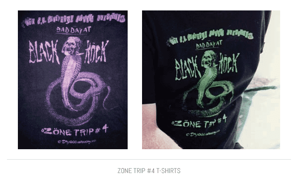
In 1990, issues of hosting the event on the beach due to an upswell of attendance and lack of a permit interrupted the burn by park police. While the statue was allowed to be erected, organizers were denied to burn it. It was then disassembled and returned into storage. Unable to burn the elaborate sculpture at its current location, several members of the Cacophony Society who attended this event assisted in relocating the experience to a new spot near Gerlach, Nevada. During Labor Day weekend, the Cacophony Zone Trip #4 “Bad Day At Black Rock” reached the desert as a strange, new venue for the previous beach burn.
As mementos for this adventure, Cacophonists Kevin Evans (snake art and text on the frontside) and Sebastian Hyde (back and sleeve art) designed a tee-shirt for the crew assembling the Man with the phrase “Black Rock Rangers” printed on the sleeve. Kevin based his design on, “…the youthful notion of destroying parts (if not all) of my artwork as a meditation on impermanence and the importance of flexibility,” also symbolic of this experience in the desert.
Finding a city that doesn’t exist
This tiny event – nearly hidden within a vast desert – made finding the location difficult and many people became constantly lost. Volunteers were recruited into locating mislaid individuals and assisting those toward the event. In 1992 Danger Ranger founded the Black Rock Rangers to serve a search and rescue function in the Black Rock Desert. That year Kevin and Sebastion designed the skull & crossbones pirate logo for the Rangers. It suited the nature of the role as Danger recalls, “…fitting for a time when gun-toting Rangers rode the far-ranging perimeter of a encampment without an orange fence.” This new logo was used on black tee-shirts and magnetic door logos on search & rescue vehicles.
New issues developed as the event continued to blossom in attendance. With an increase in the number of participants – many of which shared a different reality and proper medical facilities being two hours away – Rangers provided a burn safety perimeter around the effigy. A horrible accident would be a painful blow to the growing community.
It was during the 1994 burn that Danger had an epiphany, “Our small group of Rangers struggled to prevent participants from rushing the fire before the Man fell. After several chest-to-chest confrontations, I realized that we were all wearing a big X as we blocked their way, and at that moment I realized we needed a less-confrontational and more open symbol which embraced and protected the community.”
A history of now
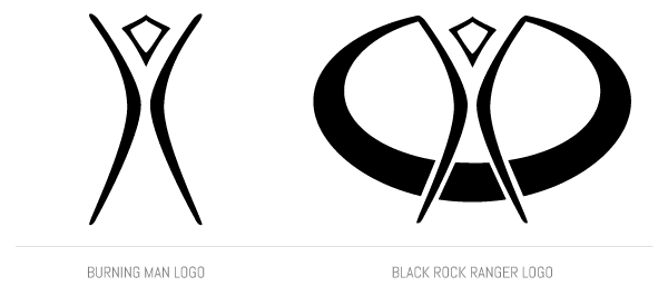
You have to remember that until 1995 the identifying image for Burning Man was still a direct replication of the Man instead of the current abstract representation we’re familiar with. That changed according to Danger when, “The Cacophony Society had a tradition of decorating the envelopes which carried the monthly newsletter. That tradition continued with Burning Man when participants decorated their envelopes when they bought their tickets by mail. On March 20th, 1995, one such decorated letter from Anita Moore arrived and I was struck by the beauty and simplicity of the drawing of the Man on the envelope.”
Stuart Mangrum (at the time, director of communications) described it as, “…a highly stylized line drawing of the Burning Man sculpture consisting of a diamond-shaped head framed by two curved ‘swoosh’ lines representing the arms and legs.” From that point onward, the image became the iconic symbol for the Burning Man organization using it on all printed materials.
On April 8th, 1995, William Barker (former advertising art director who created Schwa) was enlisted to provide the current logo a more polished appearance. William described the task, “I got a sharpie and a napkin and started sketching. First of all, I said it should be solid black so it would reproduce well even when very small. Then, that it should be contained in some way and not so entirely vertical.” Several versions were produced including ovals, circles, moons, stars, and other devices along with the original three-line mark, according to Stuart.
William continues, “While sketching, I thought of how the camp is laid out in a circle at the event and about the coming together of the community. So, I sketched the enclosing ‘swoop’ that you see in the logo that got used, and filled it in.” Danger similarly compared it to, “…a design that encompassed community, something that represented everyone holding hands encircling the Man,” which solved the confrontational problem with the existing skull & crossbones Ranger logo.
Greatly influenced by William’s drawing style, the final design became an obvious choice with its use of black & white design and the implied white lines at the base of the logo.
With a newly designed logo and an established role within the community, the Rangers now had a recognizable, but non-threatening identifier. To avoid confusion with law enforcement – the distinction of wearing costumes while on duty and not uniforms – Rangers were encouraged to add ornamentation to their issued khaki shirts such as patches, pins, cloth, and other objects to make their costumes unique. However, the logo must be readily visible for participants to quickly identify a nearby Ranger.
Rangers wear khaki, sorta
As the event evolved, new changes were required to keep up with the growth. One of which was setting up of a trash fence around what is the current city layout in 1998. To accomodate the need for control over ticket sales and eliminate people from sneaking into the event, Rangers took on the formalized roles of Gate duty and Perimeter patrol in 2000.
Those who worked Gate/Perimeter began wearing black tee-shirts with the older skull & crossbones logo to differentiate themselves due to the confrontational nature of their tasks. They became a separate, unique team within the Ranger department. It wasn’t until 2002 that Gate/Perimeter broke off from the Ranger department and became its own separate entity.
Members of Gate/Perimeter continue to wear a variation on the skull & crossbones design originally worn by the Ranger department and produce unique versions every year.
In parallel, Rangers with the necessary skills were also tasked with medical and firefighting duties for the event. In 2002, these emergency services begun to wear personalized uniforms to differentiate their role within the event. The following year, the Emergency Services Department (ESD) became a separate, individual department based on specialized needs and difference in missions. Overall similar to the Ranger logo, the ESD logo includes the addition of the emergency medical services’ Star of Life and firefighters’ Maltese Cross badges within the oval.
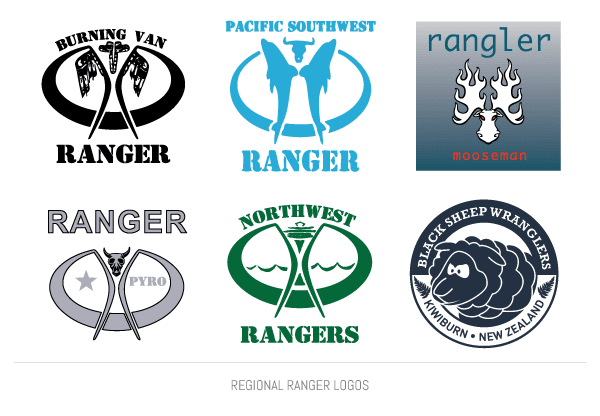
Additionally, regional Rangers have taken the original image and modified it with local culture and character. Several have continued with a variation of the stylized Man within an oval image while others have developed a unique identity that lack any of the elements from the current Black Rock Ranger logo.
As a final reminder to clear up any confusion, if there is an oval around the Man, that’s the Ranger logo. If there isn’t an oval, it’s the Burning Man logo. Now you know.
Special thanks to Michael Mikel, Kevin Evans, Ranger Crow, and William Barker for assisting in my research. If I missed key points, I welcome any updates or corrections.